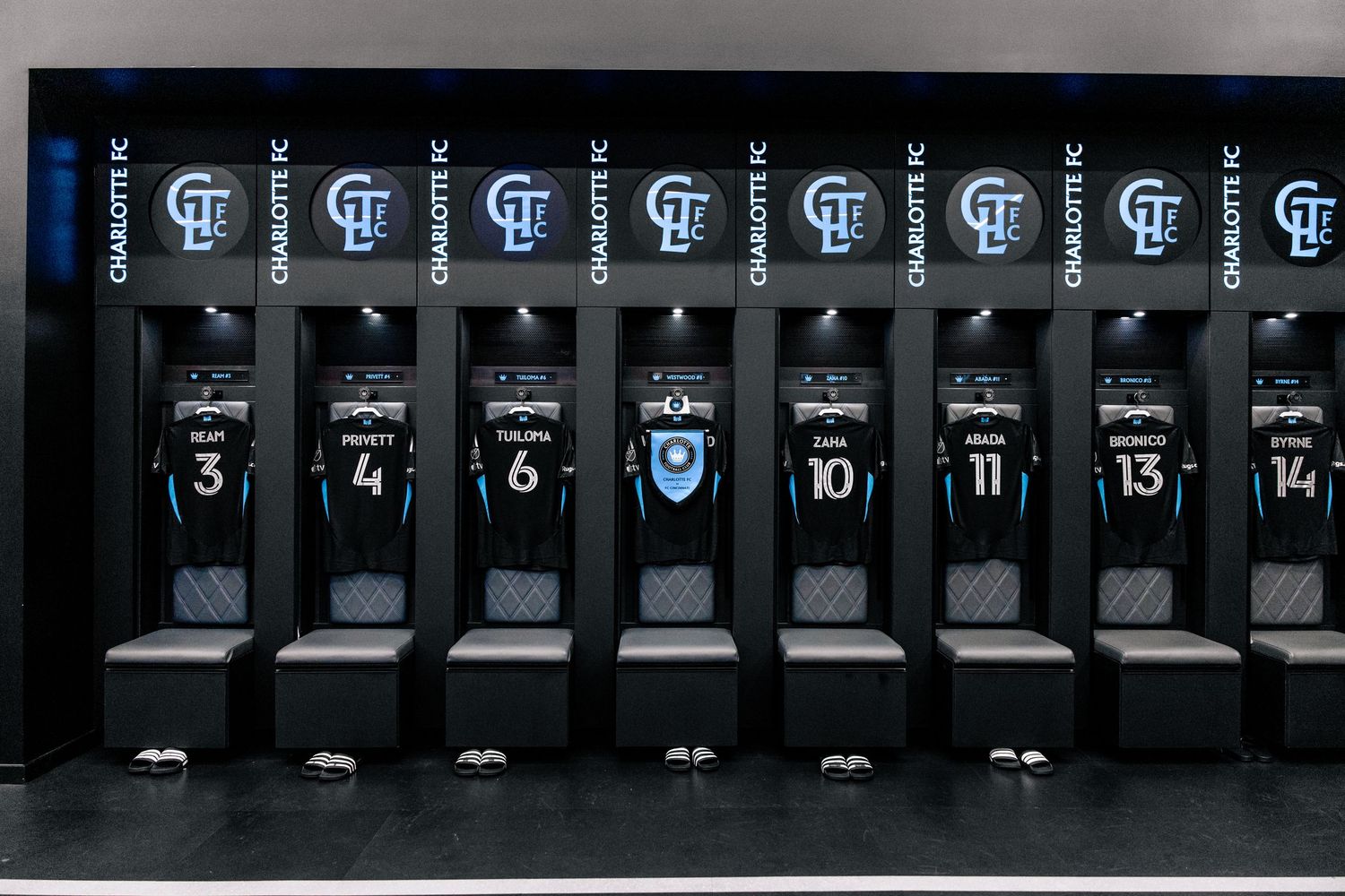
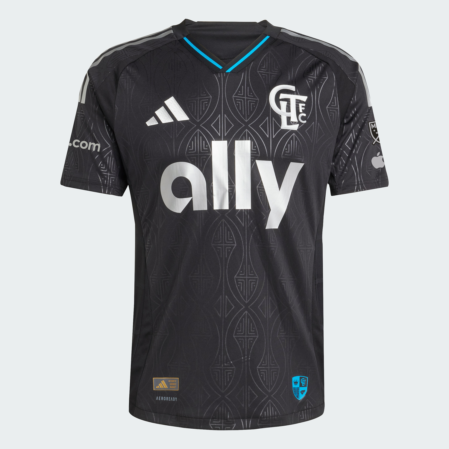
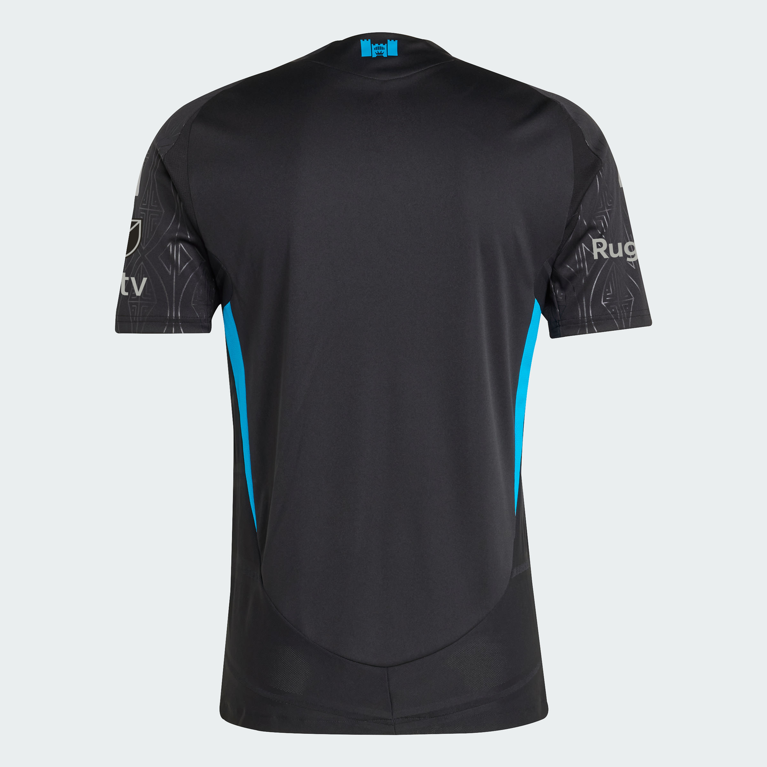
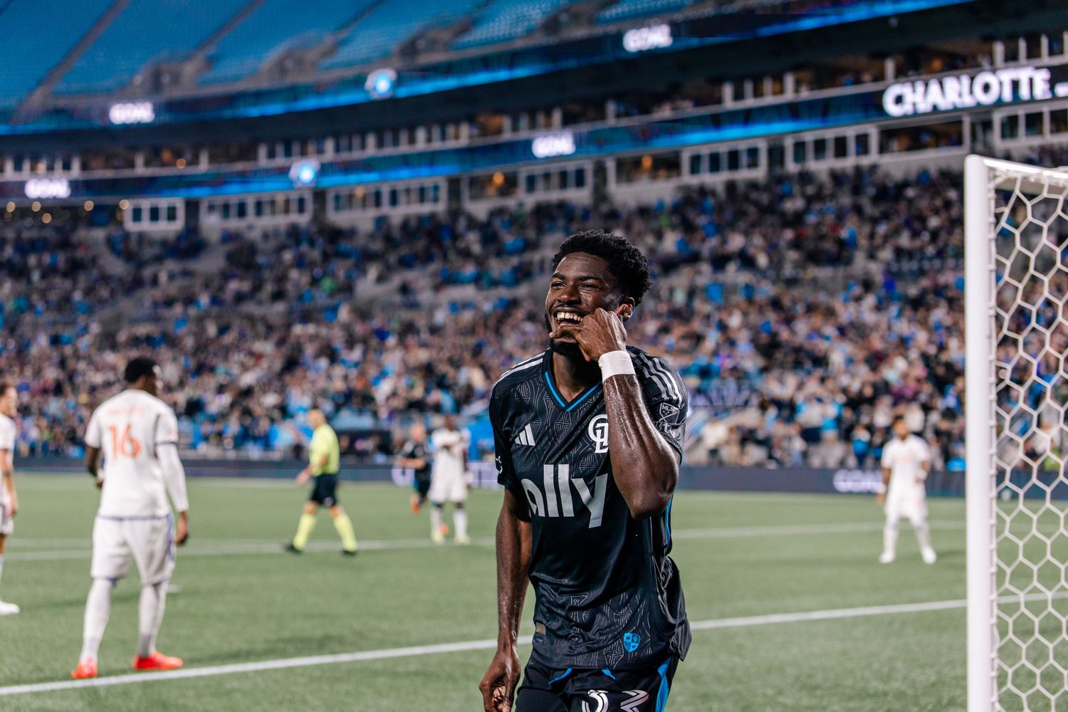
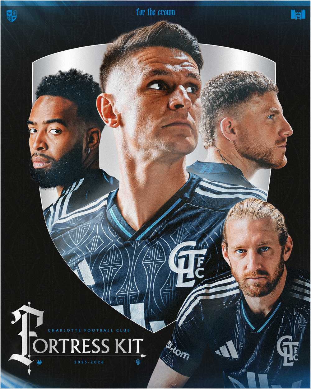
Built in partnership with adidas, the 2025 “Fortress Kit” was designed as a modern expression of Charlotte’s identity on a global stage. Rooted in club storytelling, we leaned into existing club visuals that honor traditions to create a layered narrative around protection, unity, and pride.
----
Charlotte FC's Fortress Kit was #1 in Major League Soccer in 7 days for sales, the best in club history (+6% from the inaugural season).
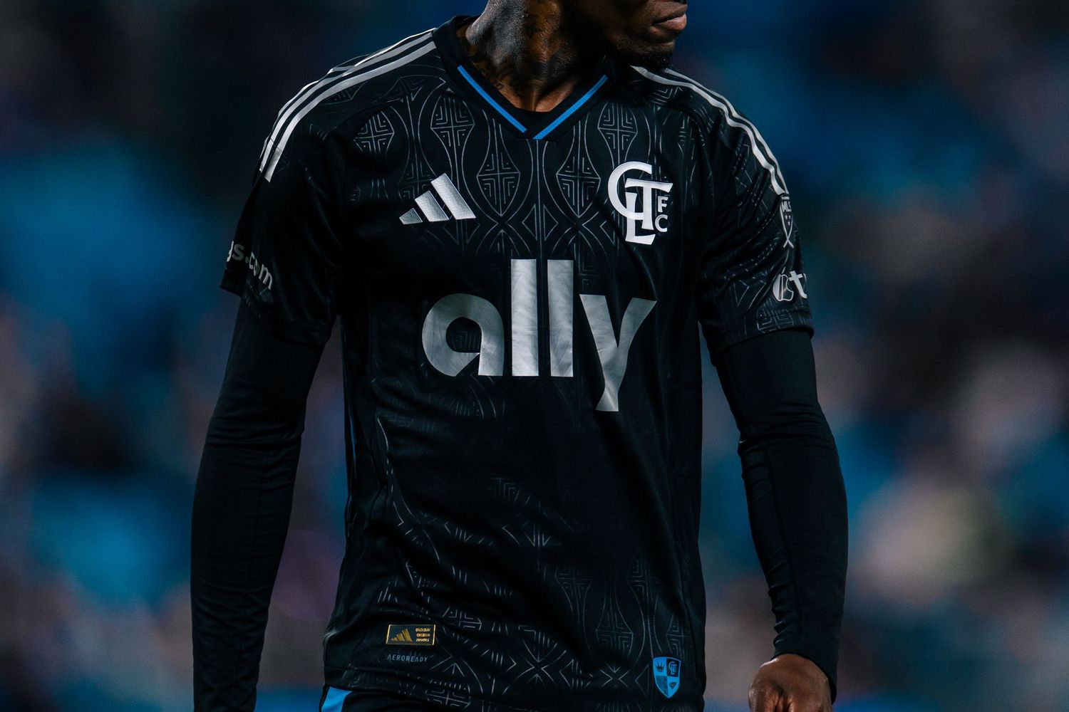
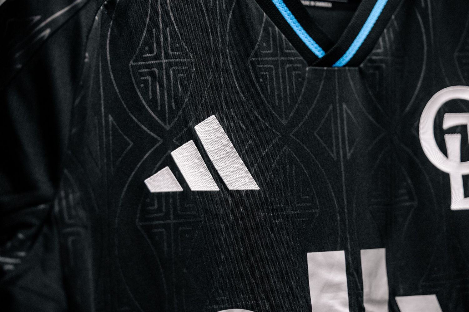
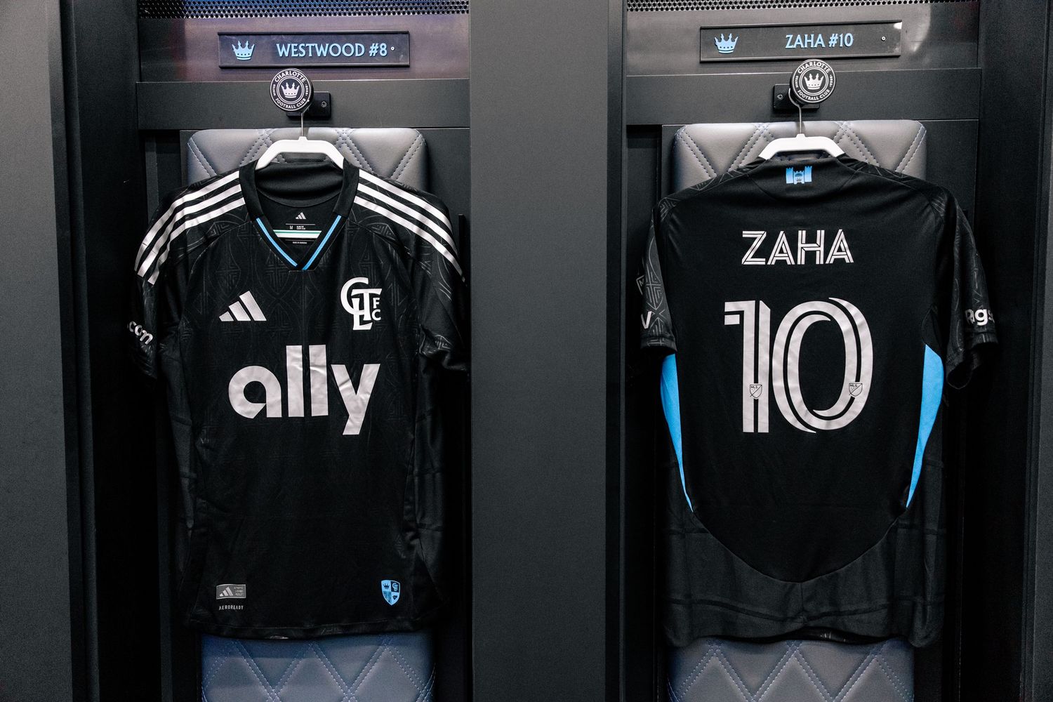
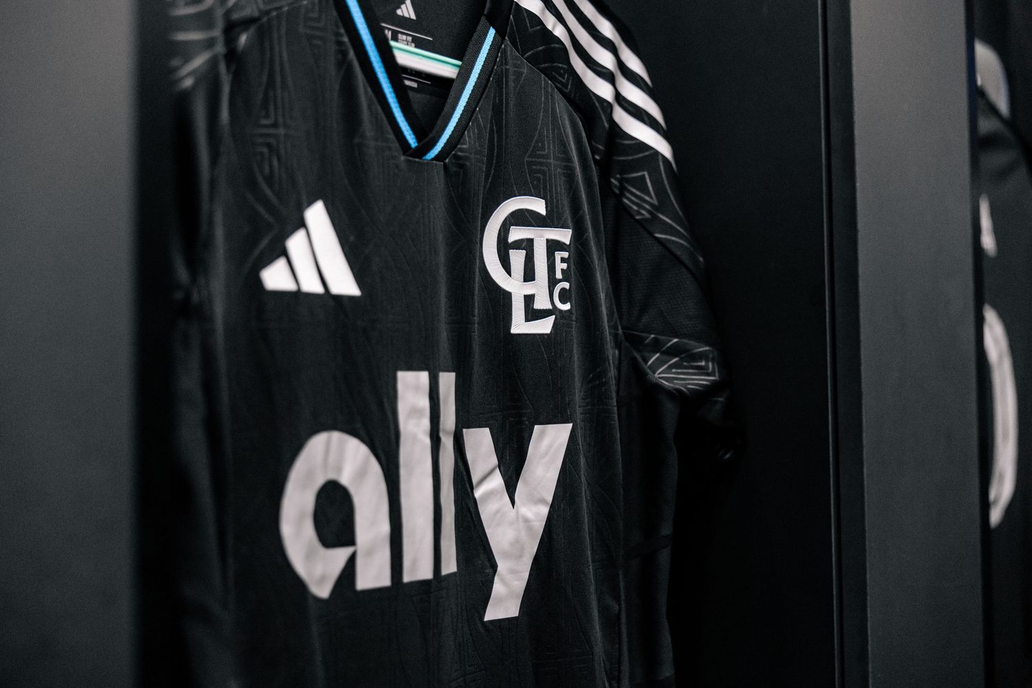
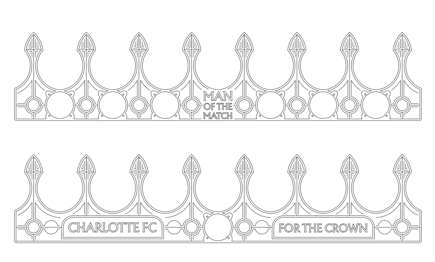
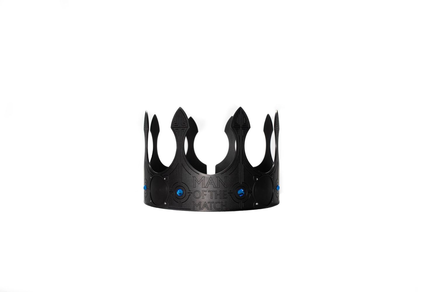
This kit was a two year process that started with a tight moodboard built around four core images to set the story and direction. Compared to past years, the adidas brief was more structured, so we came in with a clearer point of view and less open exploration. A lot of the key elements were built in house, including the Man of the Match crown pattern, which adidas then translated into the embossed material on the kit. While adidas owns the performance product template and athletic apparel construction, this was a much more club led effort than any other kit in club history, and the first time our internal team was able to design something intentionally rooted in our traditions and brand.
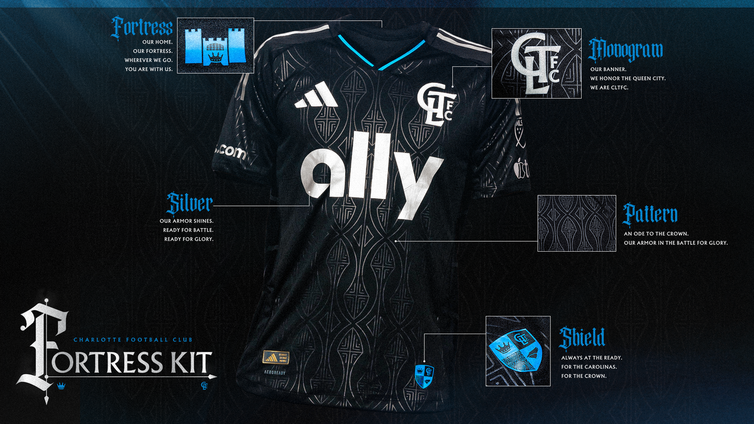
INTENTIONAL DESIGN
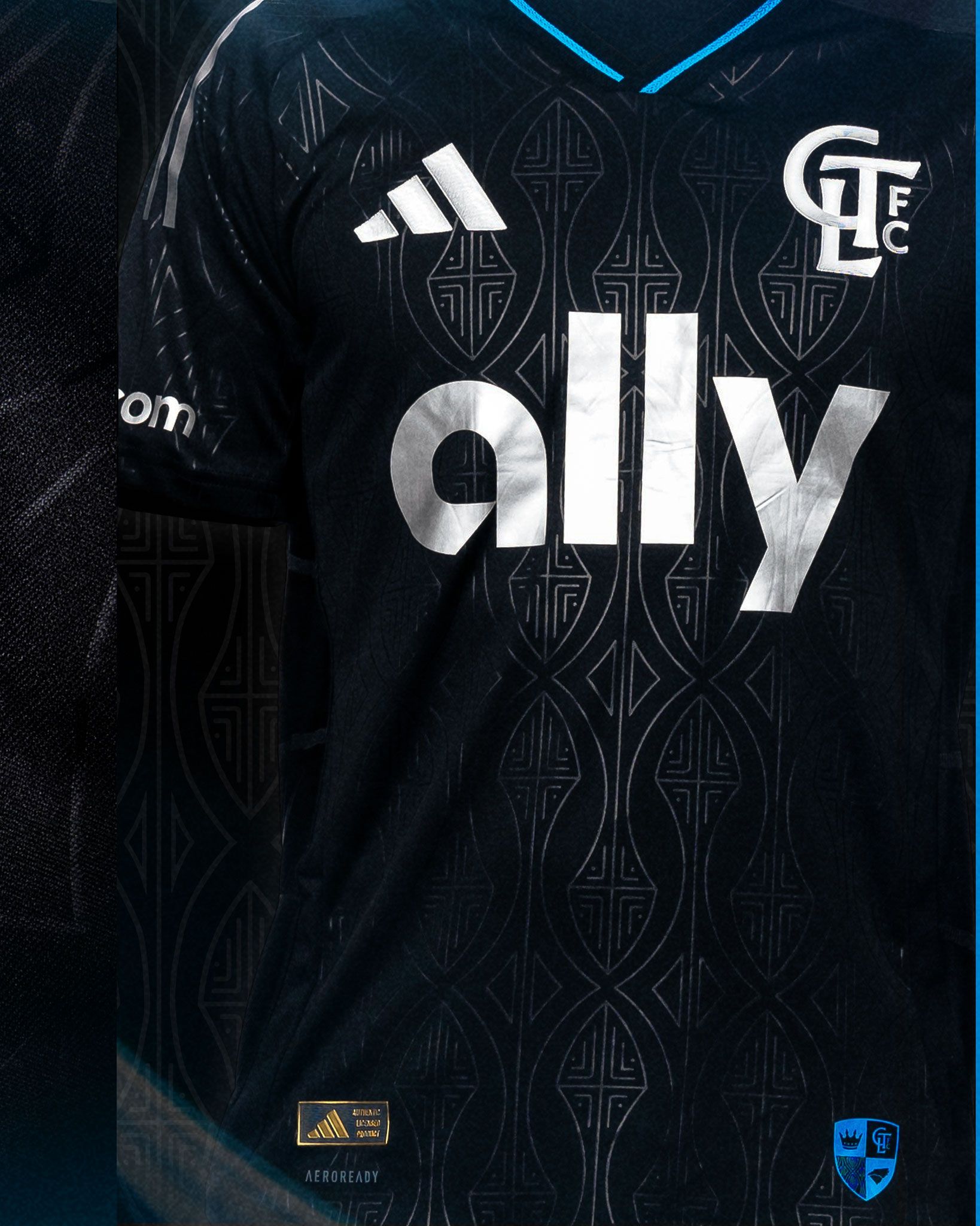
BLACK BASE
It is required that clubs have a "light" kit and a "dark" kit for MLS competition regulations. Returning to a black base was intended to be a nod to the beloved inaugural season secondary kit, the iconic fan-favorite "Mint Kit". This choice also ensured consistency with club colors being the represented in a core visual heading into the 2026 FIFA World Cup where all eyes will be on soccer in America.
EMBOSSED ETCHING
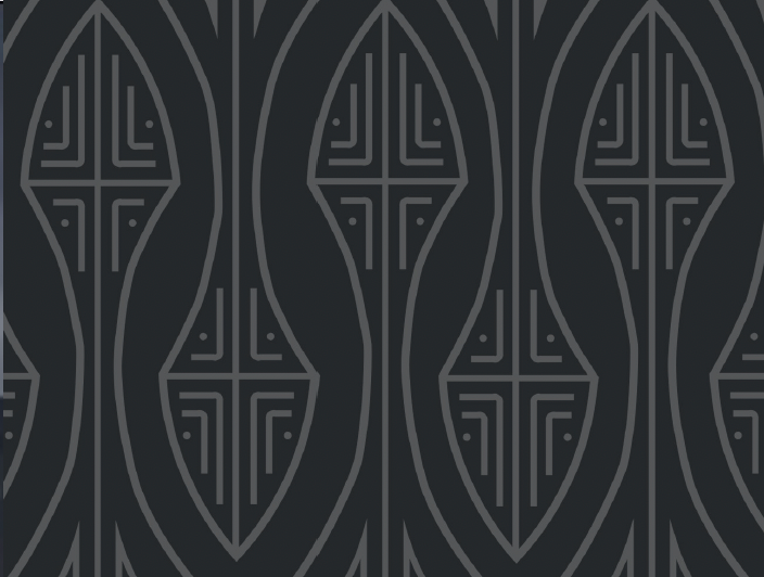
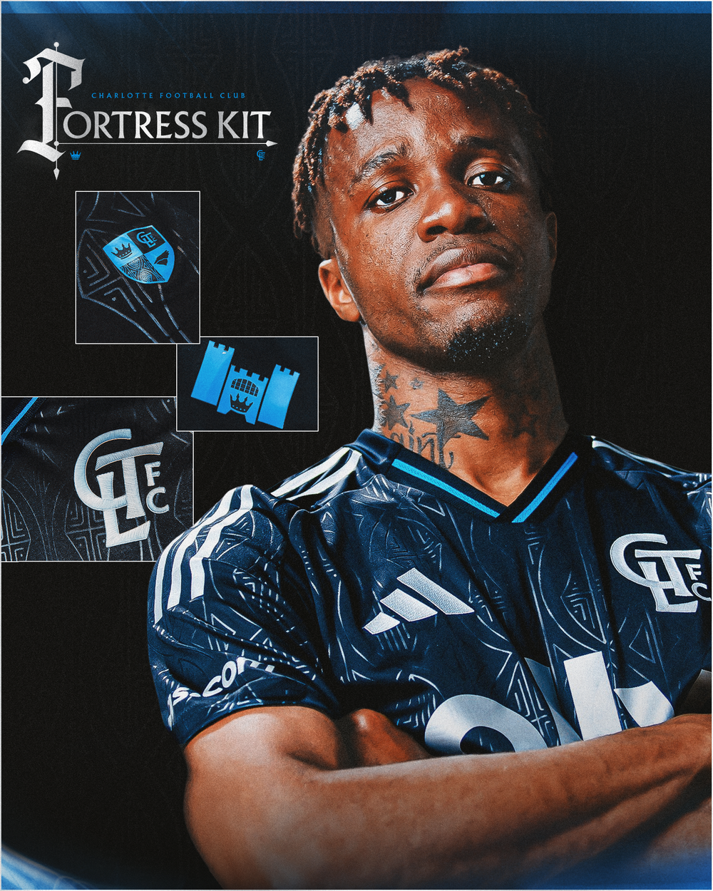
We felt strongly to include the etching from the spires of the iconic Man of the Match crown as a subtle, but strong design element. The intertwined and repeating pattern is symbolic of both a club tradition that honors the player of the match and armor worn for battle. This motif was carried over to design concepts throughout the season and lived long beyond the launch.
COLOR CHOICE
This was the first time silver really had it's moment from our brand color palette. It's a wink to the color of coins which our primary crest was modeled after. With the stark contrast of the black base and subtle sheen and shine reflection of the embossed patterns, having all logos, crests, and marks appear uniform in one neutral color created cohesive. Blue was used as the tertiary color, a flash of accent
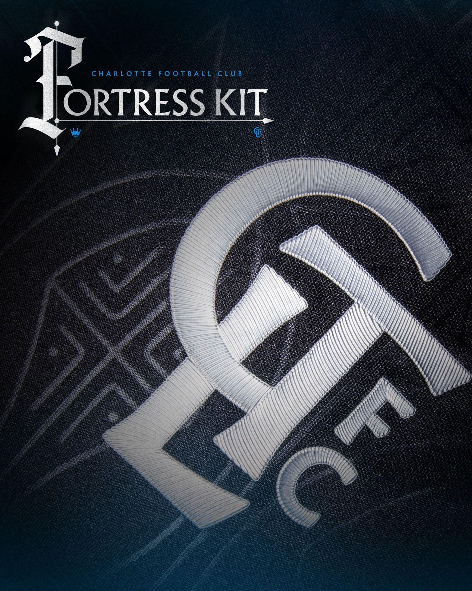
SIGNOFF STORIES
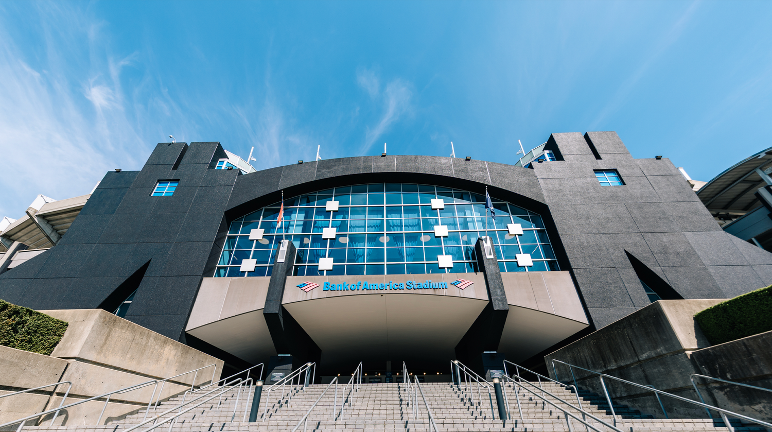
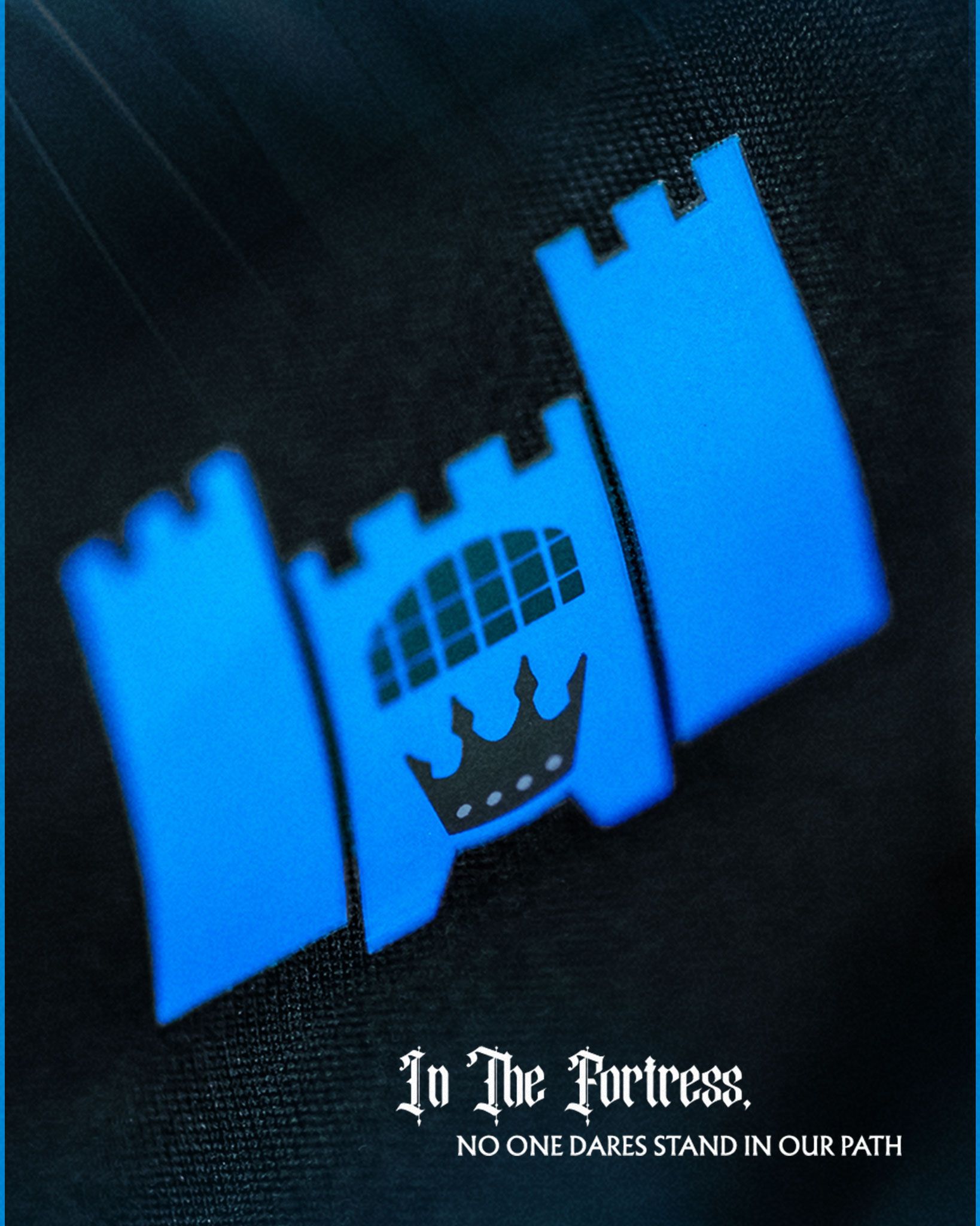
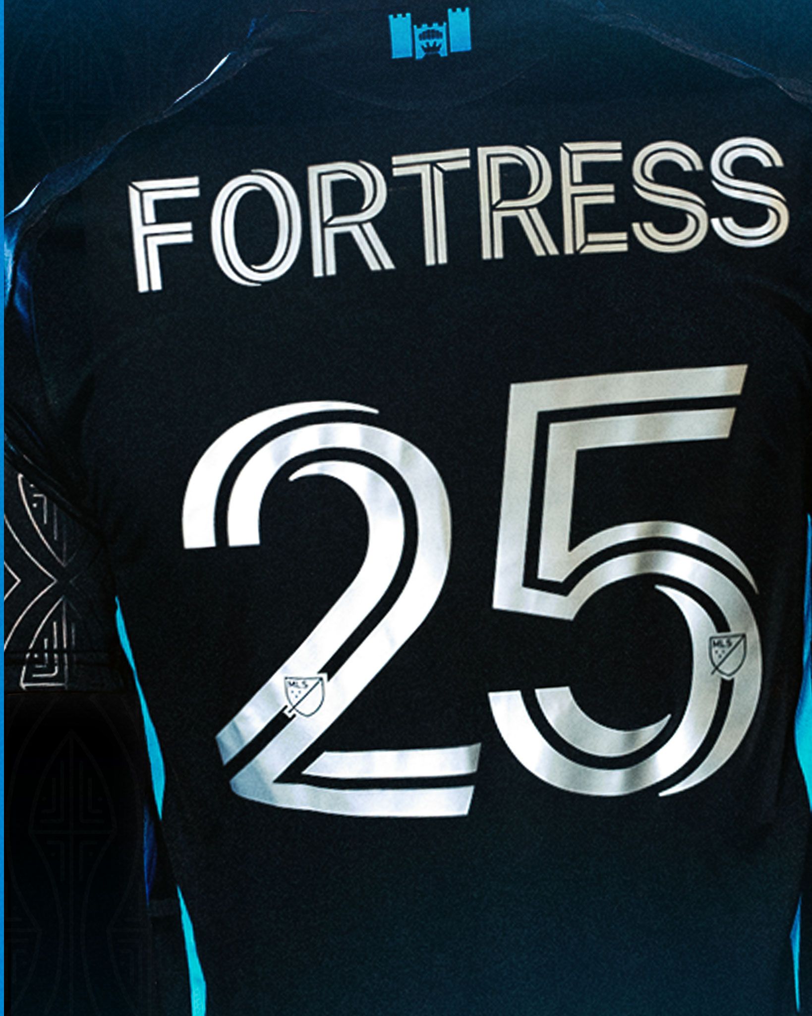
Fortress Signoff (Back of Neck): Designed to mirror key visuals of Bank of America Stadium (aka "The Fortress), home of the Mighty Black and Blue and a proven difficult place for opponents to play due to the atmosphere created by Charlotte FC's incredible supporter groups and fans.
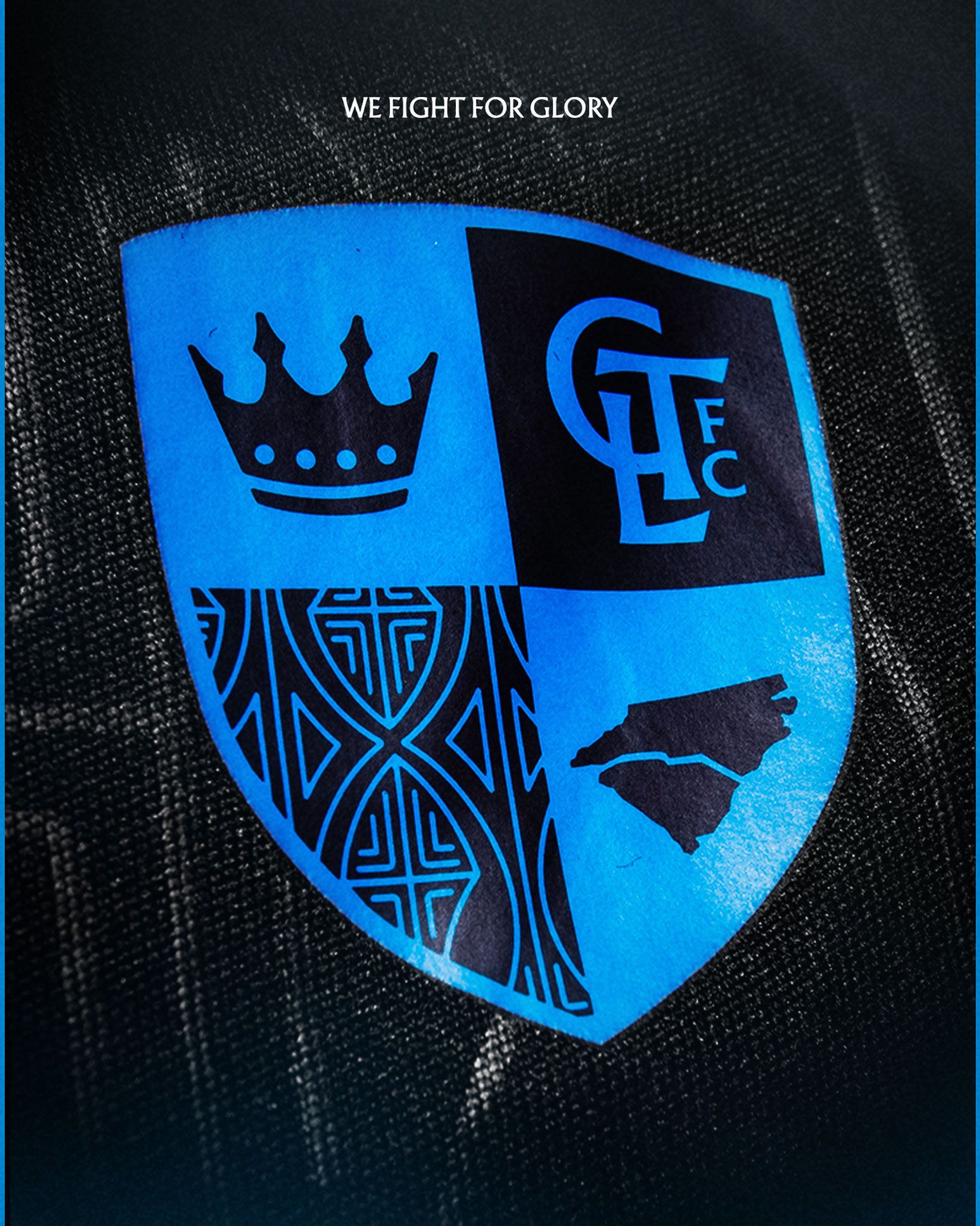
Coat of Arms (Jocktag): Designed to honor the history of knights who carry their shield to battle incorporating patterns, icons and logos that carry meaning for our club identity including the crown, the Man of the Match pattern, the lock up of North Carolina and South Carolina states and the vertical monogram logo.
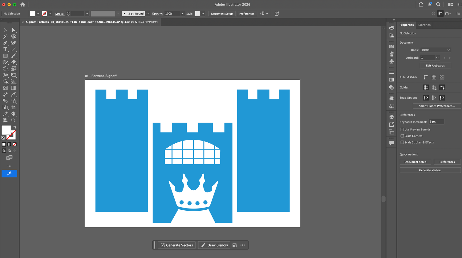
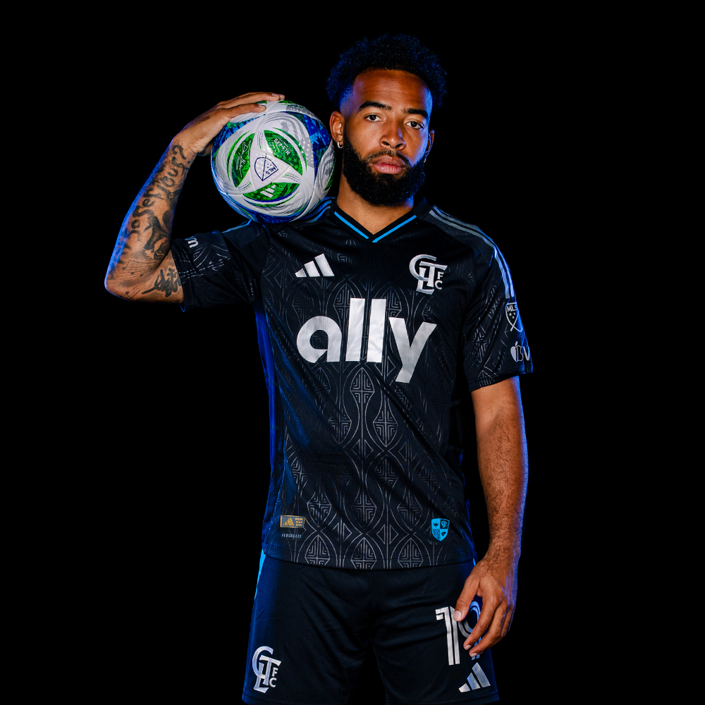
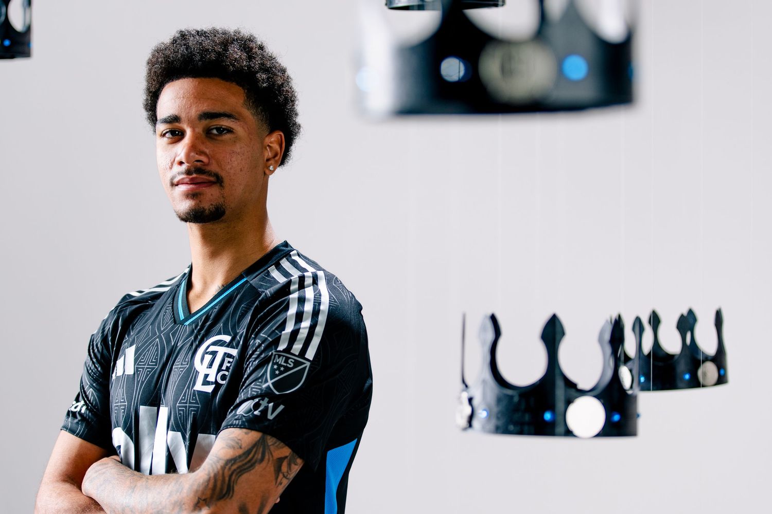
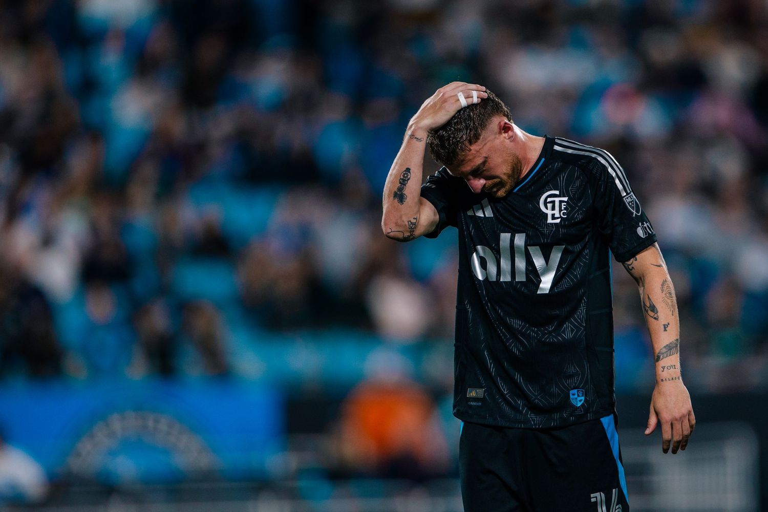
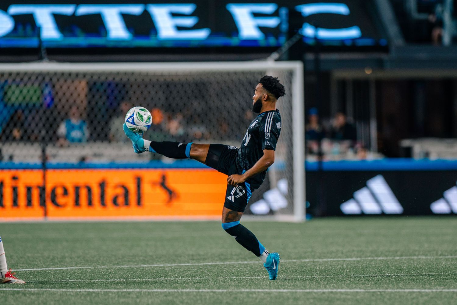
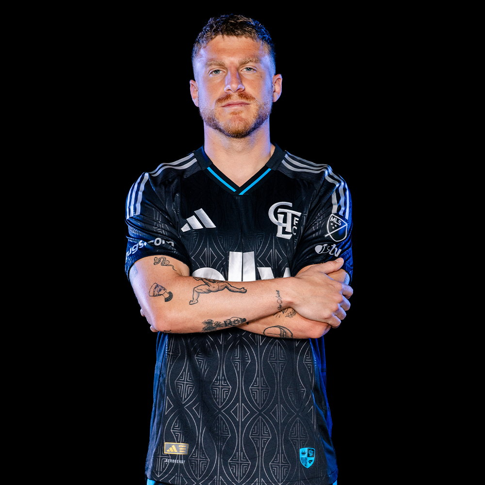
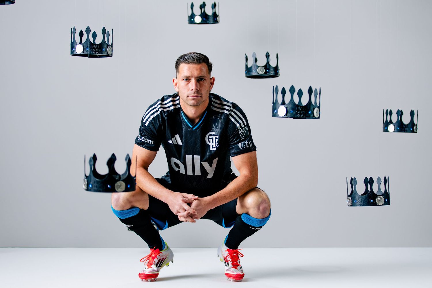
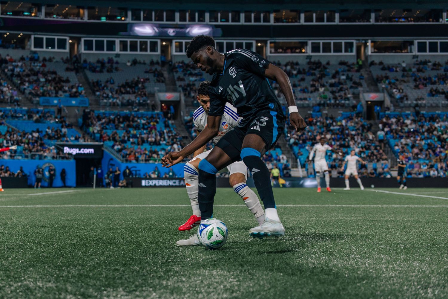
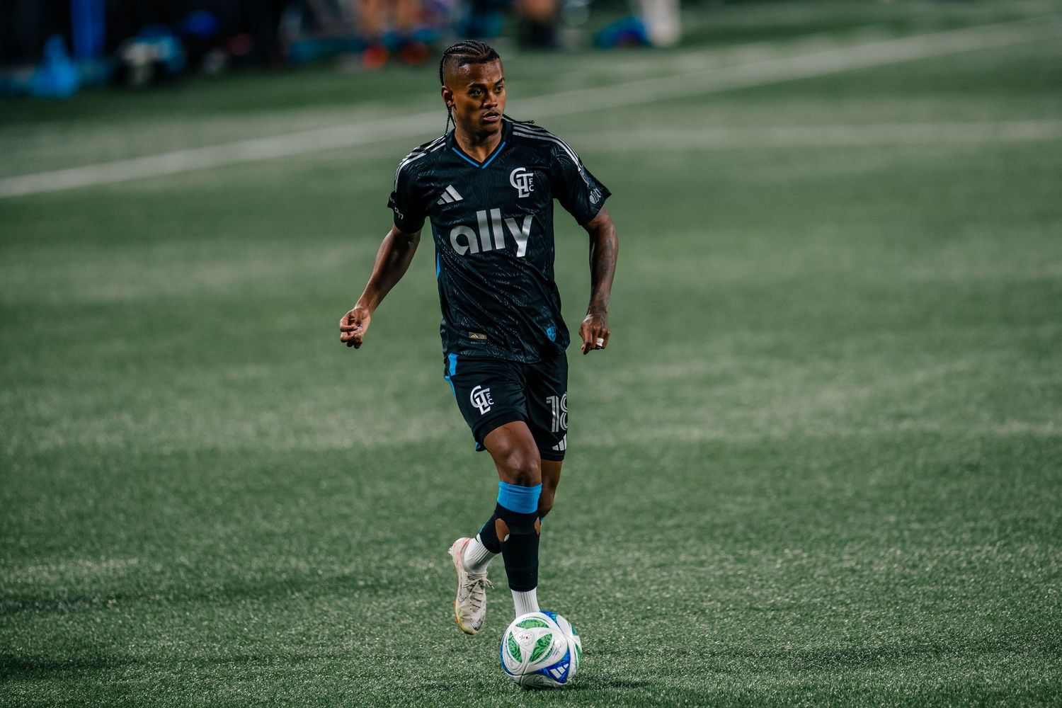
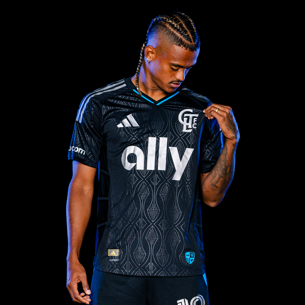
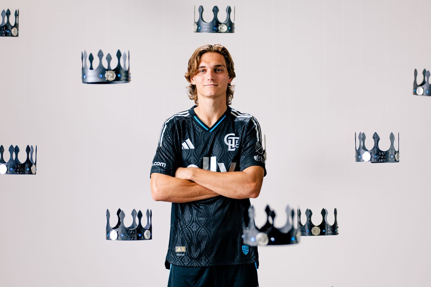
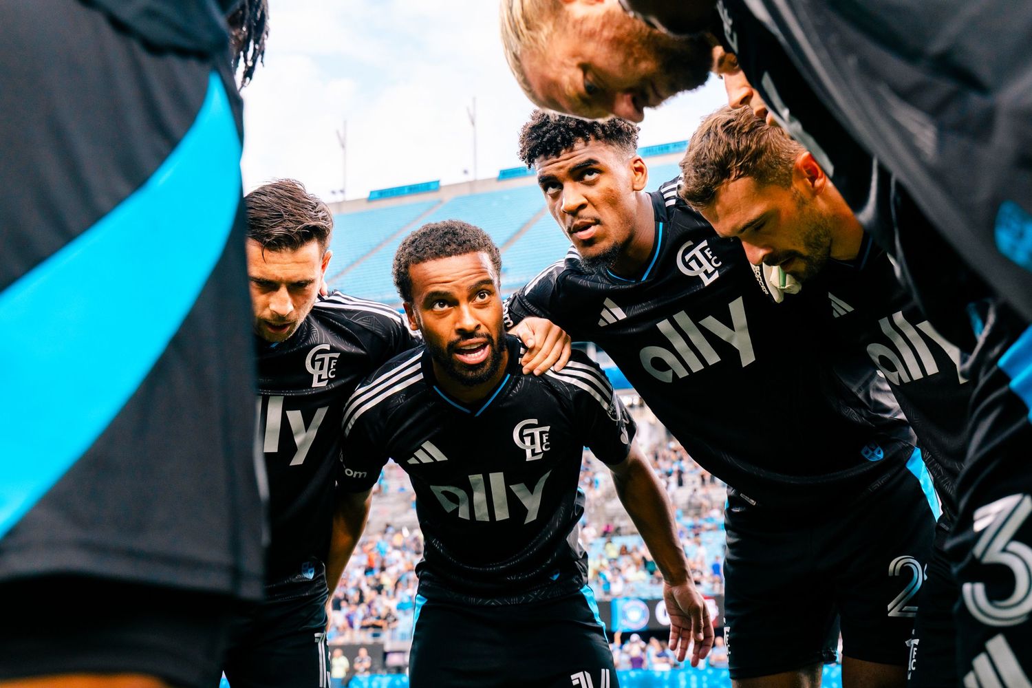
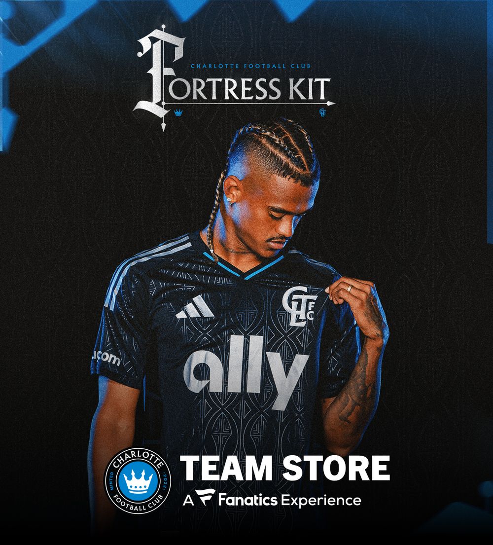
The result is a clean design that connects on-field performance with supporter culture, positioning the club as both defenders of the city and a unified force within it.
CREDITS:
Kit Design: adidas x Taylor Banner (Charlotte FC)
Signoffs: Taylor Banner - Fortress, Ryland Tunney - Shield (Charlotte FC)
Photography:
- Hollow Body Images: adidas
- Locker Room Images: Taylor Banner
- Flat Lay: Alana McCallion
- On-Pitch Action: Taylor Banner
- Gray Production Set: Alana McCallion (Creative Direction: Taylor Banner)
- Black Production Set Bee Trofort-Wilson (Creative Direction: Taylor Banner)
Graphics:
- Tessa Hansen, Hannah Keiser, Nathalie Cairo, Aidan Dietrick, Taylor Banner
[ It takes a village! ]