Charlotte MLS
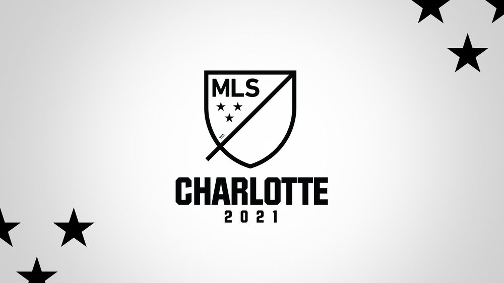
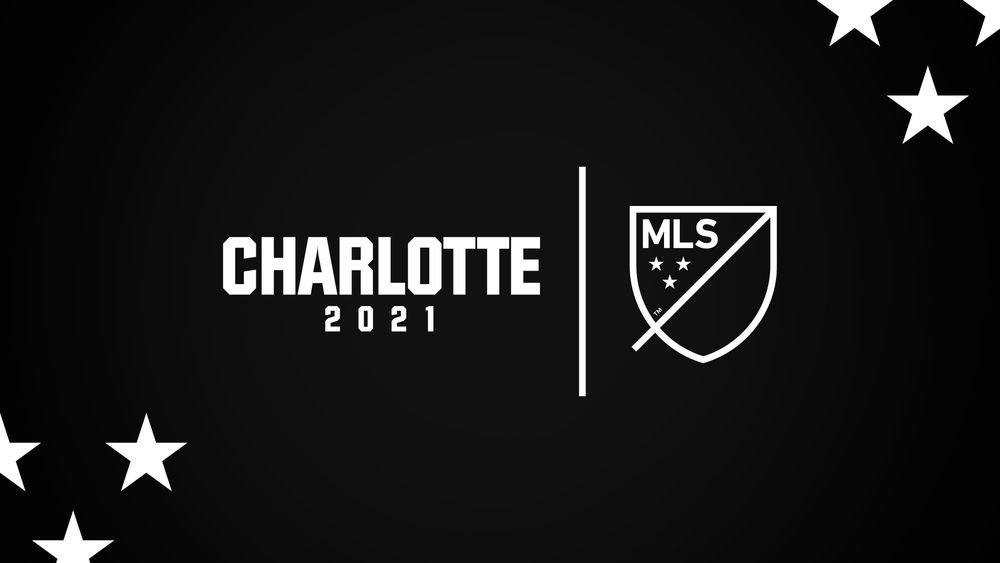
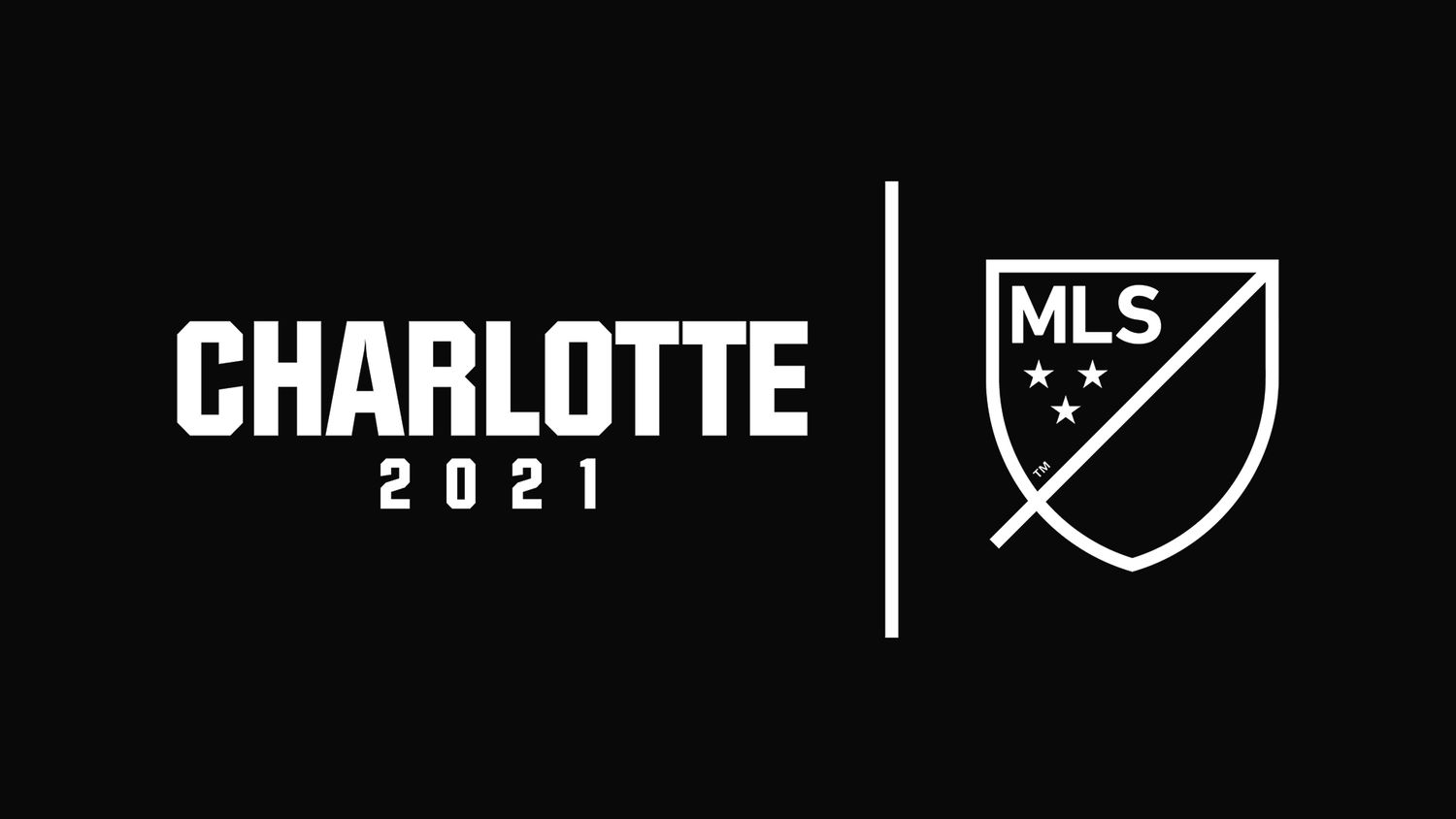
Before Charlotte FC had a name, a crest, or even colors — we had a placeholder: Charlotte MLS 2021. That was it. No official brand, no visual identity, just a black-and-white holding brand for something that wasn’t public yet.
Designing within that vacuum was one of the hardest things I’ve done.
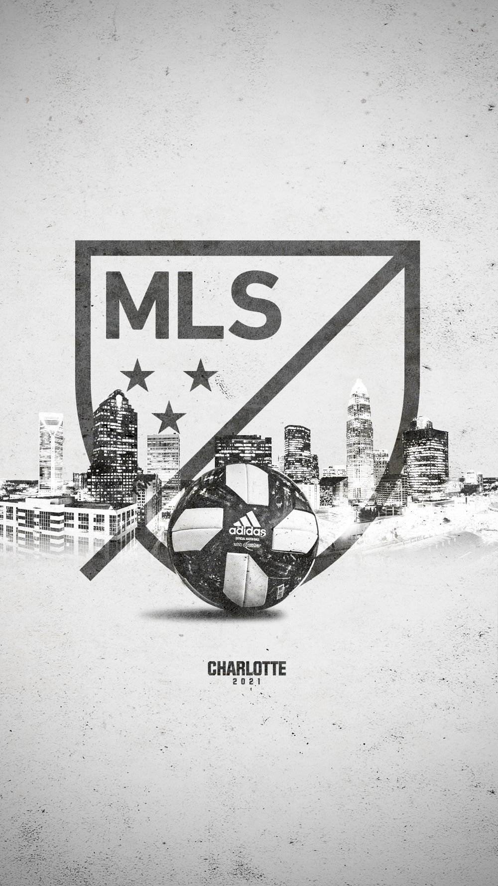
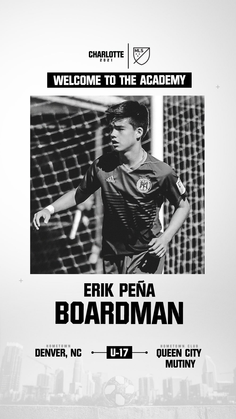
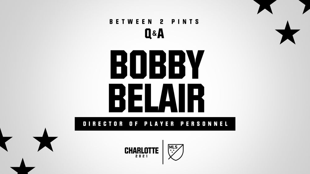
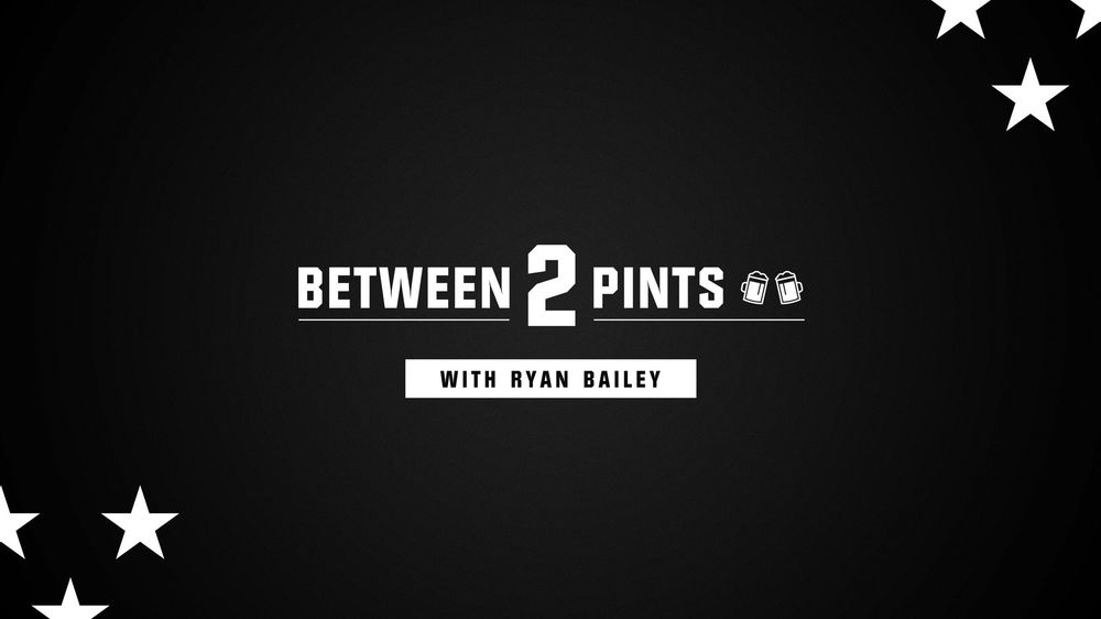
We couldn’t reveal the club’s name or visual assets, but we still had to show up like a team — on social, in video, across podcasts, and in community content. The limitations were intense: two colors (black and white), one typeface with limited weights, and the MLS shield. That was the entire toolkit. Everything had to look consistent, intentional, and polished while saying almost nothing.
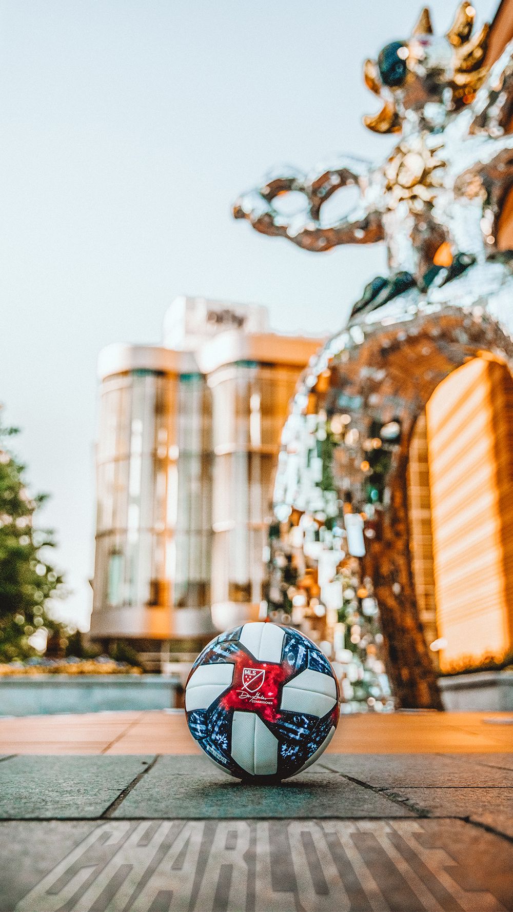
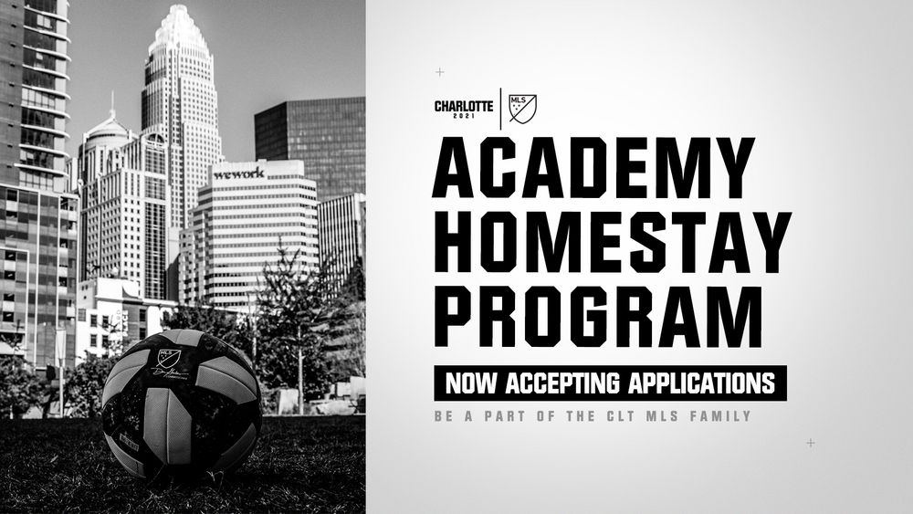
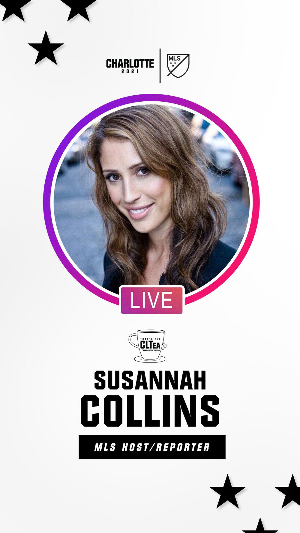
So we leaned into what we could say. We borrowed stars from the MLS shield, stuck to the type system, and let Charlotte itself do the heavy lifting. I took the latest MLS match ball and photographed it around the city. In front of landmarks, on empty streets, at skyline overlooks. All to quietly but clearly say: soccer is coming here.
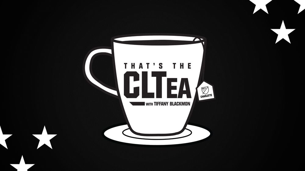
I built full creative systems for YouTube series, podcasts, and social content — all for a brand that didn’t officially exist yet, anchored only by a single on-air personality and a whole lot of trust in what was coming.
It wasn’t easy, but it was foundational. Those constraints forced us to get scrappy, smart, and focused and that helped shape the clarity of the brand once it was finally unveiled.
circa 2020